
Brand Your Freemium WordPress Plugin Without Ruining the User Experience
How do you balance presenting your brand in freemium plugins without being too intrusive into your users site? Try this activation notification banner.
One of the challenging aspects of the “freemium” WordPress business model is advertising the premium version to your users. Often WordPress users take for granted that they’ll be able to find a free plugin on the Repository. Having to pay for a plugin requires a real need for most users. Even further, some get very bothered or even offended if your free plugin has a lot of overt advertising built within it, no matter how subtly or intuitively you place your ads.
For us, we now offer a suite of Business Reviews Plugins, each with their own free and premium versions. We realized that communication with our users is a major priority. So I was tasked with trying to emphasize our brand and Premium plugin offerings within our free plugins in a way that our users would not be offended by.
There’s a couple things I tried to keep in mind in terms of the user experience. Whatever I built out needed to keep these best practice user experiences in mind:
- There should not be any advertising apart from where the user might expect it, meaning limited to the area where our plugin is obviously supposed to be
- The plugin should not alter the user browsing experience
- The user should be able to easily dismiss alerts if they exist
- The user should never be opted in to anything automatically.
With those things in mind, there’s a few methods a plugin developer could take
“Provided By…” – Some free plugins want their brand on the front-end of the website when their free code is used. You’ll see this often with widgets and themes. You’ll see a subtle “Provided by SchnazzyTool 5.0!”. Doing this automatically is prohibited by the WordPress Repo, so tough luck getting your plugin or theme accepted if you try that. But some like to provide their users the option to add that.
The idea is that those using the free plugin help benefit the author by driving traffic to the author’s website. Personally, I can’t imagine an instance where doing that would be helpful to the website. While this method does actually give the user the ability to opt-in to it, I don’t find it beneficial to the viewers of those users’ websites.
“Welcome Page Redirection” – Sometimes a plugin has a lot of functionality and really needs some detailed explanation. In that case, having good instructions in the Settings of that plugin most often will suffice. Some plugins feel that is not enough. For example, when you activate WooCommerce in your site, you’ll get automatically redirected to a WooCommerce “Welcome page”. This is a really well-designed page that informs you with text and media of all the cool things you can do with WooCommerce and gives you links to get to the place in the backend where you can start using WooCommerce right away.
This makes a lot of sense for a massive plugin like WooCommerce. There’s a lot to learn and do. But keep in mind, 9 out of 10 plugins when they are activated just redirect you to the plugin page with a simple activation message. The other place you’ll see a Welcome page like this is every time you update WordPress. So keep this in mind. The biggest and most robust plugins, and WordPress itself does activation redirection.
What plugin authors need to keep in mind is a variation on that old lesson we tell our kids about taking home sea shells:
If everyone did that, there’d be no more “normal” user experience left.
It also encourages a redirection war. If a user bulk-activates a bunch of plugins, who’s the one who’s going to trigger their redirection last and ultimately win the users attention? Bottom line: This should really only be used in cases where it’s really justified.
“Activation Banner Method” – This is the method I opted for in the end, and what this write-up is about. Basically, the “normal” user experience when activating a plugin is that they are returned to the Plugins page and an activation notice is added at the top of the screen informing the user that the plugin was successfully activated. This is the behavior that users are trained to expect. So deviating from that norm needs to be extremely justified.
To me, taking the expected behavior and enhancing it with helpful information and perhaps a style upgrade gives the user an enhanced experience with your plugin. Add to that enhanced experience the ability for the banner to be dismissed whenever the user wants to (instead of automatically when they navigate away) and you’ve got a very intuitive and aesthetically pleasing enhanced user experience that also benefits your product without being obnoxious to your users.
Keeping the activation banner to the Plugins page is also very considerate of your users because it means that only those with “Admin” privileges will be able to see the banner. I don’t know about you, but anytime I’ve built a site for a client and find that a stray plugin is putting notices on every page regardless of user role, I get a little irked. This avoids that irk-i-ness.
I also want to give a hat tip to Chris Wiegman of iThemes Security fame. When I was researching ways to do this, he’s the one that said “don’t do the redirect”. Install iThemes Security and you’ll see how they do their plugin activation banner with a giant dismiss button as well. It’s really well done.
Creating Your WordPress Activation Notification Banner
So let’s get to it. For ease of use I’ve created a working demo plugin that you can just install and see the banner live. (or… you could install our Google Places Reviews, Yelp Widget Pro, or Yellow Pages Reviews plugins to see it in action there too!).
You can grab the demo plugin here. I’ve marked it up with as much inline documentation as possible. Feel free to add questions about it here or at the repo.
And here’s what the final result looks like:
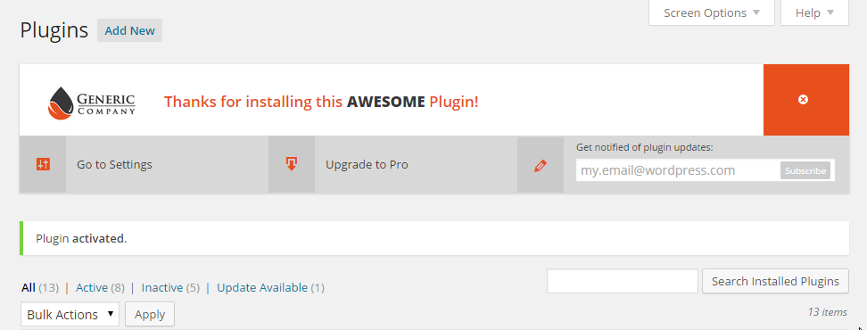
About the Code
The code is really straight forward. It really just does 2 main things:
- It hooks into the plugin activation sequence by using WordPress’ `admin_notices` hook and triggers the function that outputs the banner
- It adds user meta data to the current user. This allows our first function to check whether or not the banner should be triggered based on that meta data.
About the Banner
For me, this kind of banner does three important things:
- It provides the user some direction on what they should do next. It can sometimes be confusing for users to know where to go next after a plugin is activated. For example, maybe your plugin doesn’t have any settings, so in the first “action button”, you can say instead “Add a Widget”.
- It provides you a place to put your brand in front of the user while still allowing them to dismiss the whole thing.
- It also gives your user the ability to opt in to get informed about your plugin. Communication with users is the one thing that having a plugin on the WordPress Repository can’t do. You can get downloads and support requests, but actually communicating well, within your own business’s branding and “funnel” is basically impossible. So giving the upgrade link and the newsletter opt-in field is a really important thing.
About the Style
Some developers really believe that everything about your plugin should be styled extensively. This makes your plugin almost feel like something totally independent of WordPress. I don’t agree with that.
Others think that your plugin shouldn’t style ANYTHING in the backend. You’ll notice in the screenshot above that just below the banner is the WordPress default activation notice. It’s simple, clean and very clear. Our banner, on the other hand stands out really clearly. It’s up to you how to find the balance between standing apart from the crowd, or blending into the whole WordPress experience seamlessly. The issue is, as soon as you want to add additional blocks to the standard notice, you start to run out of seamless ways to integrate the content that you want.
We Can’t Appease Everyone
Throughout this article I’ve mentioned things I’ve heard from users and other developers about the user experience. You can see that it’s a really sensitive subject. One can easily take for granted that plugins are really powerful tools that can alter the user experience for good or for bad. That’s why a subject like a little activation banner can produce so much discussion and even “emotion” within the web development world.
I’ve encountered plenty of users (mostly “advanced” developers) who feel it’s a total affront to their independence if a brand or “foreign” object lands into their website backend at all. There’s even plugins on the repo that try to remove the “clutter” of other freemium plugins. I can understand that, but as someone who feeds and clothes his children on revenue from our plugins (and soon themes too!), I know that A LOT of hours and skill and ingenuity goes into our code. It’s nice to be appreciated with Tweets and likes and shares… but that doesn’t buy school uniforms or health insurance.
I’ve also heard a lot of discussion about freemium plugins on the WordPress repo and how they have less and less value because authors keep all the “really good” functionality in their Pro versions. There’s a lot to be said about the Freemium model and how best to keep your users happy without nickle and diming them. But what’s important is keeping the user experience in mind with every decision you make.
For me, weighing the pro’s and con’s of all those methods above is what “best practice” is all about. If our users who use our free code love our product and sign up for updates, that’s the proof in the pudding. That shows that they’re glad we put this front and center and are happy to be in communication with us. So far, with these banners live for a little over 30 days, we’ve seen a steady and continued growth of our lists. To me, that means those who don’t care, dismissed the banner and are happy. Those who want to hear from us signed up first, then dismissed the banner, and are also happy. Win win.
As a matter of fact I was about to complete a plugin for my client, going to use this boilerplate :) Love it (Y)
Wonderful concept! At RatingWidget (https://wordpress.org/plugins/rating-widget/), we brand all the admin notices generated from the plugin. Besides the value of brand recognition, users automatically recognize that the notice related to our plugin which makes the UX slightly better. https://www.dropbox.com/s/9idsuvtocr437gn/Screenshot 2015-06-10 20.38.02.png?dl=0
Hey Vova. I agree that appearing "Native" can be an advantage. Our primary goal with these banners is to get those links in front of our viewers eyes. We found that they were not finding our Support or Docs very well. We’ve seen good results by making these links more prominent. And I think most end users (not wp devs) don’t have a strong opinion about how native the alerts look, but instead might see a more attractive banner as a sign of a more polished plugin. WooCommerce is pushing this really hard (maybe too hard). iThemes does a really god job with this actually (we took some cues from them on ours). Regardless, I really like your branded notification as well. Thanks for chiming in, as always.
doesn’t work in 4.4 ..any ideas why?
It’s working for us in our plugins with 4.4 still. Our Google Places plugin and all our Give Addons still use this basic format. Good luck!
i might have clicked the "x" button and can’t make it come back..any ideas on how to reset it?