
Detecting, Targeting, and Testing Mobile Devices with Javascript
You’ve been there before. You are coding some great theme or plugin and you get to a point where you…
You’ve been there before. You are coding some great theme or plugin and you get to a point where you realize that you want something to change ONLY for mobile devices. It happens. They’re so small and have such unique needs sometimes, that you end up needing to do some very targeted things for them.
So I sought out a simple way to detect the user was on a mobile device, then swap out the class name of an element. Seems simple enough, right? Well… it’s a bit of a rabbit hole, it turns out. Here’s all the things you need to take into consideration:
1) Are you really just wanting to target mobile devices, or just a max-screen-width? Because you could use media queries instead.
2) How are you going to test this? If you’re developing locally you can use browser testing tools like crossbrowsertesting.com or whatnot.
3) Are you really just wanting to affect one element for mobile browsers, or are you actually trying to remove a desktop element, and replace it with a mobile element?
Those are important questions, so here’s what I did:
1) Targeting Mobile Devices
Yes. In my case I couldn’t worry about whether the user was on a really wide tablet to fit the content I was displaying. A media query could do it for most of the users out there, but I’m sure it would still fail 2-5% of the time for some mobile users. So it was just safer to target ALL mobile browsers (so binary, black-and-whitey of me, I can’t even handle myself!)
So in order to only target mobile browsers, I stumbled on this great script from abeautifulsite.net. There’s quite a few out there that try to do this, and they all fall victim to one thing: You can’t predict ALL the devices that are out there. Too true. So this script attempts to target the mobile Operating systems instead. There’s far fewer of them and they aren’t likely to change their names, and it’s not very likely that there will be some wild new Gecko browser or something anytime soon. Of course, if that does actually arise, it’s easy to just add it to the list.
For posterity, here’ the script:
var isMobile = {
Android: function() { return navigator.userAgent.match(/Android/i); },
BlackBerry: function() { return navigator.userAgent.match(/BlackBerry/i); },
iOS: function() { return navigator.userAgent.match(/iPhone|iPad|iPod/i); },
Opera: function() { return navigator.userAgent.match(/Opera Mini/i); },
Windows: function() { return navigator.userAgent.match(/IEMobile/i); },
any: function() { return (isMobile.Android() || isMobile.BlackBerry() || isMobile.iOS() || isMobile.Opera() || isMobile.Windows()); } };
One thing I should mention, since I often write about WordPress, is that WordPress has a function built-in for this purpose. It’s called wp_is_mobile(). If you’re building with WordPress you can definitely leverage that for an almost perfect solution. With the pure Javascript method above, you have more flexibility to apply more browsers (like Palm! See the video below where I discuss that).
[UPDATE:] Just got feedback in AWP that wp_is_mobile() won’t work for this specific situation since it would get cached. So even in WordPress, this is a pretty reliable and useful method.
2) Testing Mobile Device Functionality in Different Browsers
Because we’re developing locally, our testing options are limited to stuff you can do in the browser. I mean you could use Chrome as a bridge between your desktop and mobile device, but I’m WAAAY to lazy for that! So it’s time to dig into extensions and devtools.
So one way we can do this is to trick our browser into acting like a mobile browser. It does this by switching out what’s called the “User Agent”. That’s a constant across all browser, both desktop and mobile, they all have User Agents. So if our browser presents the html information with a User Agent that says it’s Android or iOS, then what renders on the page adjusts for that.
Ironically, Internet Explorer has an excellent User Agent switching tool in it’s Developer Tools panel. It really makes it easy to test, and it incorporates Live Reload. Honestly… slow clap for IE11 folks. The one catch is that the list of Mobile Browsers equals 1, Safari/iPad. There is a custom field where you can type in “Android” or “BlackBerry” and it works fine too.
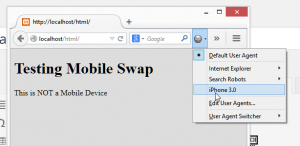
Chrome has a User Agent switcher, but you really have to dig to find it.
 Firefox has an excellent DevTools editor, but NO user agent switching in it. So instead I tested with this excellent extension called “User Agent Switcher”. I really liked it because it’s sooo much easier to use than the DevTool approaches in Chrome and IE.
Since we are just testing for the User Agent and don’t really care about the browser environment too much, so you don’t need to test this in all three browsers. Nevertheless, there’s a video at the end showing how you can do this in each of the major browsers. Just for you… I like you guys ;-)
No posts found.3) Adding or Swapping elements for Mobile Devices
This all depends on exactly what you are trying to accomplish. For me, I wanted to show a link for desktop browsers and a slightly different link for mobile devices. Since I was doing this in WordPress, I knew that jQuery would be available, which is awesome in this case because it’s SOOO much easier to do this with jQuery than vanilla Javascript.
So here’s my markup. Notice the id’s and you’ll see the logic. One should show up on a mobile device, the other on desktops:
<p id="is-mobile" class="show">This is a Mobile Device</p>
<p id="is-desktop" class="show">This is NOT a Mobile Device</p>
So what I want to do is swap out the class="show" with a class="hide". Then, of course, I have a .hide {display:none;} in my CSS.
I already have the isMobile() script from above. Now if I wanted to add a class to these elements with jQuery, I could just use addClass('hide'), and that will honestly work, but it’s weird to apply a bunch of styles to the .show just to hide them with the .hide. So it’s better in this case to swap them out. jQuery also has a great variable called .toggleClass(), which is exactly what we need in this case. So here’s the code I used to swap out those elements:
jQuery(function($) {
    if (!isMobile.any())
    $('#is-mobile').toggleClass('show hide');
    if (isMobile.any())
    $('#is-desktop').toggleClass('show hide');
});
Summary: This is About Functionality, Not Design
So there you go. It’s super useful knowing I have this in my toolset now. But it’s important to recognize that this is really about functionality, not design. The only way to test your responsive media queries is by adjusting your browser size and especially using something like crossbrowsertesting.com.
And, if you really want to see it all in detail, here’s a quick video of the three browsers, particularly highlighting the Firefox extension since it’s the most robust and thorough of the three options.
How can I use this code to deactivate some elements only for opera mini (not opera) browser?
Hi there, the line that says “Opera” is just the nickname. If you look towards the end of that line you’ll see that it’s for “Opera Mini”. Then if you want to JUST target Opera mini, instead of .any in your code, use .Opera.
Thanks for stopping by! Hope to see you around more!
Will you please provide me the whole code? I’m not good at coding. If my adsense code is abcd, then how I can deactivate abcd in opera mini?
Two things: 1) If you use WordPress, I’m actually in the process of bundling this into a plugin. Watch my blog for updates on that. 2) If you don’t use WordPress, I worked with another developer at FooPlugins to refactor the code to make it ever simpler. Here’s a Gist of that: https://gist.github.com/mathetos/4d80d5c7bf2d23fd2a7e
This is absolutely wonderful. Thanks for coming up in my Google search!
I did something similar, but used C# in the back-end to do the IsMobile() like you wrote in javascript. The server then makes the choice what the user sees and not javascript. I like the server making these choices. If you have javascript making decisions on what the user sees on the client, could lead to things going wrong if your javascript malfunctions. The fact that javascript makes this decision also causes your customer/user to download more content than what they will be looking at. This in a production environment could be a very costly mistake.
Thanks for your feedback. Server side options are useful too, but that doesn’t mean using a JS method is costly or a mistake. Just look at AngularJS, or Backbone and you’ll see tons of really robust functionality being used as clientside.
After writing this though, I stumbled on WP Mobile Detect (https://wordpress.org/plugins/wp-mobile-detect/) which is a server-side option for WordPress. I haven’t tested it but it’s based on a PHP class that I dug into while researching this article. Worth a look for sure.
Do you need unlimited content for your blog ? I’m sure you spend a lot of
time writing content, but you can save it for other
tasks, just search in google: kelombur’s favorite tool
Good post Dear i also think java script is a good way to detect device and redirect device specific page
ex
if( /Android|webOS|iPhone|iPad|iPod|BlackBerry|IEMobile|Opera Mini/i.test(navigator.userAgent) ) {
window.location.href = ‘http://mapofstreet.com’;
}
I use a similiar script but I use “window.location.replace” instead of “window.location .href”
ex
if( /Android|webOS|iPhone|iPad|iPod|BlackBerry|IEMobile|Opera Mini/i.test(navigator.userAgent) ) {
window.location.replace(“http://yoursite.com/”);
};
help me check mobile blogger
hey… if we use for impression ads views… it still load count ?
Oh thanks your article mobile detectect