The New WordPress Plugin Directory and Why It Matters
The WordPress Plugin Directory is getting a facelift which could result in users finding relevant plugins more easily — both there and by Google.
The WordPress Plugin Directory is currently getting a facelift. This could result in users finding relevant plugins more easily and plugin authors being more responsible. That is IF it gets implemented well.
Full Disclosure: We’re plugin authors. Almost 100% of our revenue depends on how well users find our plugins on the WordPress Plugin Directory, are able to download them, provide us feedback in the support forum, and give us ratings. Quite often it’s frightening how dependent we are on this one Repository. But so far, it’s been excellent for us and we believe for our users as well.
So when the volunteers that govern WordPress.org start taking serious steps toward radical change of this directory, we pay attention. Overall, the change is really attractive, but — as they say — the devil is in the details.
At a quick glance, our Give plugin page will go from this:
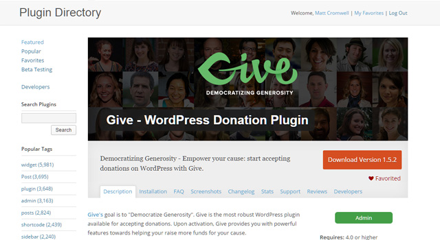
To this:
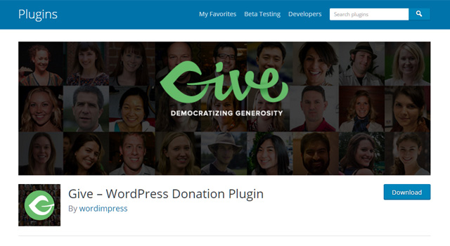
Pretty nice!
Also the main page itself will be updated from this:
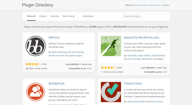
To this:
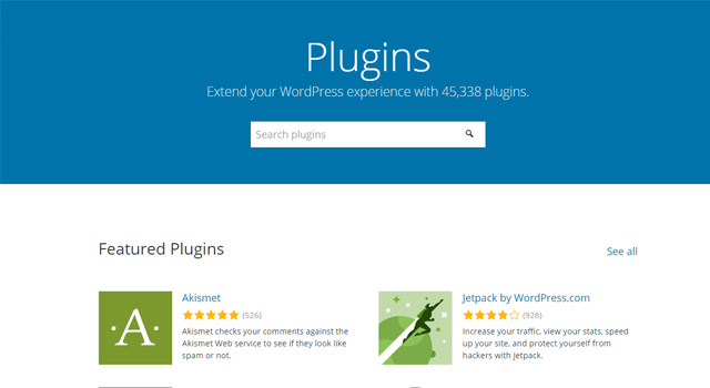
As we’ve been tracking the progress of this new design, several key things have come up that I see as really important:
- Better Search
- More power to Plugin Authors
- The Single Pages really still need Improvement
Better Search
WordPress itself is infamous for its search functionality. Since WordPress.org is run on WordPress itself, it suffers from the same lack of relevance of its search feature. One way WordPress users generally improve WordPress’ search is by using Categories and Tags effectively. That is one way that the new design is drastically improving the plugin search feature — adding Categorization.
The net result is very clearly an improvement. For example, search “Donation” on the current design and you get this:
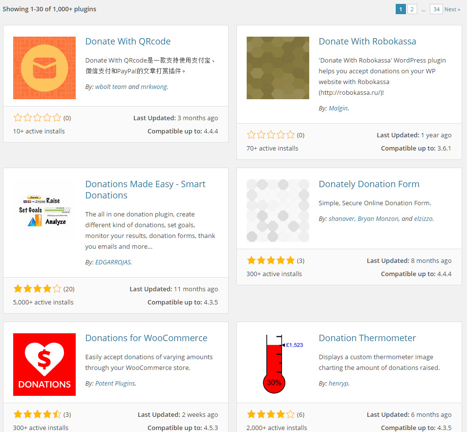
On the new one, you get this:
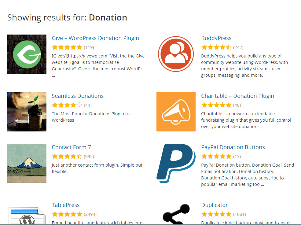
That’s an improvement, not only because Give is at the top, but the others that are at the top are also much more relevant and well respected plugins for that search query than the previous results.
Another striking contrast in the results is searching “SEO.”
It’s like night and day. How did anyone ever find anything relevant in the past!? I have no idea!!
Around here we often ask about a user’s “search intent.” How did they actually find our plugin in the first place? Was it on the Plugin Directory? It could have been through a Google search or they could have searched through their Dashboard.
Ideally, the new design — since it has more relevant content on the page than the old — should produce better Google search results. And ideally, the new results we see in the new design should affect the search in everyone’s Dashboard as well. Both of those important elements are yet to be seen though.
More Power to Plugin Authors
I’m very excited about the new Dashboard they are building out for Plugin Authors. Here’s a sneak peek:
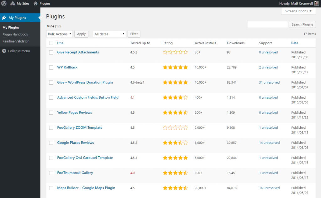
As you can tell, it’s a standard WP Dashboard, but with only ONE menu item: Plugins. From there you can see all of the info about all of your current plugins. This enables you to edit the categories your plugin is in, the minimum version number, and many other aspects of your plugins readme file without having to change it directly in the plugin code.
As Head of Support I spend every day working in the .org Support Forum. There’s also a massive effort going into updating the forums right now. When I log into the Plugin Author Dashboard, I can see a column showing “Unresolved Tickets.” OMG… my heart just skipped a beat! What if I could just click on that number and it would take me to the unresolved tickets for that specific plugin? That would be a game changer for me.
They’ve also moved all the “Stats” from the single plugin page, to this Dashboard area. I understand the logic, but I will say that I enjoy being able to see other plugins stats. Still, I think this opens up the possibility that a lot more data could be shared here eventually. There’s been a lot of discussion about whether there actually IS more data available or not, or how WordPress might provide a global opt-in option for simple tracking purposes. But seeing these stats here, and thinking of how this might improve is very exciting.
The Single Pages Still Need a lot of Improvement
‘The team received feedback from Matt Mullenweg which is changing the direction and design of the page.
“We’re really just at the beginning of design iterations,’ Obenland said. ‘He thinks we can do better, which he’s right about. We can and we should.’”
~ WP Tavern
I agree with Obenland and Mullenweg. The single pages need to do better.
The current design relies on faux-tabs (meaning links that look like tabs but don’t act like tabs — I hate faux-tabs) to separate different elements of the plugin readme file to keep the content focused on one purpose.
But the new design uses truncation to allow users to expand/collapse each section. Ahmad Awais put together a nice piece on the new design and got feedback from several plugin authors who really didn’t like this feature. Personally, I’m starting to really dislike it for three important reasons:
The description is most important, but truncated to be as important as everything else on the page.
The line where the “Read more” starts is too abrupt. It cuts content is ways that just don’t look nice at all.
If you expand the content, you can’t reduce it again without scrolling down really far. This makes the user experience really less than awesome.
What’s great is that the Meta Team is listening and being responsive to feedback. In their latest post, Konstantin Obenland highlights the criticism of the single page and its faux-tabs, and discusses additional areas that they are already working to improve. For example, this is an exciting idea:
A future enhancement we’d like to add that has been discussed quite a bit is showing categories on the front page instead of (or in addition to) curated sections to show the breath and depth of the directory. An additional section could also include “trending” plugins, with an algorithm backing it.
It’s Not Done Yet!
With all that in mind, I think the re-design is an important and necessary move in the right direction. But I’m glad they are taking their time and getting feedback from users and plugin authors. If you want to get involved in this project, here’s a few resources:
- The latest post from the Meta Team on the feedback and invitation to the next meeting, which is this week: Wednesday, August 3.
- Discussion about the new Plugin Directory design happens on Slack in the #meta channel. Here’s info on joining the WordPress.org Slack Channel.
- All progress on the design is tracked with Trac. Here’s the currently open tickets related to the Plugin Directory.

This plugin landing page design is frustrating both as an user and as a plugin developer. I know there has been lots of discussion, and promise that it’s not done yet, but somehow I have a feeling, it might not change a lot in the final version, because after months of discussion, I don’t see much changes to address that major criticism. Kinda sad!
Come to the meeting on Wednesday, have your voice heard (you won’t be the only one expressing frustration with the single plugin page) and make your judgement from there. This meeting on Wednesday was initiated specifically for this purpose.
"That’s an improvement, not only because Give is at the top" – Ha, awesome ;)
Filters. Filters. For the love of all that is holy, filters! I don’t want to see 50 three year old plugins without even so much as a placeholder image. Grr!
This is very much disappointing for some reasons that this NEW plugin single page interface is not only user-friendly for general user but also developer. Most importantly, "read more" button repeated once more times. Even, I found read more button on plugin video tutorials… Kinda Sad