
What I Learned by Contributing to Twenty Sixteen
I can’t believe it’s been TWO YEARS since I wrote this little post on my first contribution to another author’s…
I can’t believe it’s been TWO YEARS since I wrote this little post on my first contribution to another author’s WordPress plugin. It was a great feeling way back then. Since then, I’ve always wanted to extend that feeling to contribute directly to WordPress Core. Today I can proudly say: “Bucket-list item: Checked!”
This December WordPress 4.4 will be rolling out the door with a brand new default theme: Twenty Sixteen. In it you’ll find two small items that I contributed to:
- The singular.php template file
- That “tel” and “number” inputs are consistently styled and the input background color is cross-browser now.
Neither of these are ground-breaking changes, though this will be the first WordPress default theme that doesn’t come with a single.php or page.php file at all because of singular.php. You can read up on singular.php here and here, and see my commit to see how I applied conditional logic to display different elements depending on whether a page or post or attachment is being viewed.
This was also the very first time that the Core Theme Team used Github exclusively for code contributions, issue tracking, and merging. Honestly, that is what made it so easy for me personally to contribute, because we use Github daily at WordImpress I felt extremely comfortable interacting there and contributing there. I really hope that continues so that eventually Trac itself is just a memory.
Lessons Learned
While my contributions are small, I still learned a lot. Here’s just a couple of the highlights of things that struck me as cool, interesting, or made me go “hmmm..”.
WordPress CSS and PHP Coding Standards
One of the awesome benefits of working in Github is the native integration with Travis-CI. This is an online tool that allows you to enter in your coding standards, and then have every Pull Request on Github be processed through to check whether it passes the Coding Standards or not. It highlights the problems directly so you can revise fairly easily.
I was a miserable failure at getting my singular.php to pass the standards. They are not all that challenging (you can review them in detail here), but I simply overlooked some basic ones far too often.
You might think it’s silly to haggle over whether your code is indented with tabs or spaces (and how many spaces is a whole other debate!), but in the end it’s just about having consistent code across the whole project which makes contribution easier for everyone. Big thanks to the Core Themes team for their patience with me with — I’m embarrassed to say — far too many PR’s to count.
I love Singular.php
The reason I really wanted to contribute to Twenty Sixteen was specifically because of the potential power of singular.php. I hadn’t seen any other themes really leveraging it yet, and I knew that Twenty Sixteen was the perfect case for it.
Basically, singular.php has a higher priority than index.php but a lower priority than page.php or single.php. That means that if you don’t have page.php or single.php (or any iteration of custom post type templates) then singular.php will be used instead of index.php.
For me, it’s all about being more DRY (Don’t Repeat Yourself) in WordPress themes. The awesome team at Roots.io has been preaching this for years now, and I believe adding singular.php to the Theme Heirarchy was a move in that direction.
This is good news because at the end of the day, you could simply have a strong index.php and strong singular.php file and your theme could be very robust and lean code-wise. Previously, if you wanted to have a more DRY technique you really had to have at least index.php, page.php, and single.php. Less files, less code, makes for a cleaner, leaner, quicker page speed. Win!
The :not CSS pseudo class is awesome
Amazingly, this was the very first time I’ve ever come across this CSS pseudo-class. It really seems like it’s custom-made just for WordPress.
The :not pseudo class lets you apply your CSS styles to a class as long as that class doesn’t also have another selector that you designate within the :not. Here’s a great example from Twenty Sixteen:
body:not(.search-results) .entry-summary {
 color: #686868;
 font-size: 19px;
 font-size: 1.1875rem;
 line-height: 1.4736842105;
 margin-bottom: 1.4736842105em;
}
So, the above says: “Apply these styles to the .entry-summary div unless the body as a class of .search-results.” Like I said, this is perfect for WordPress themeing because of how WordPress adds custom class names to the body element or the article element. This helps you add some basic logic to how you apply your styles without having to use a pre-processor to apply that logic and spit out 4 times as much CSS for the same result.
BONUS: Twenty Sixteen also has a healthy use of the :empty pseudo class. It even uses these two together like this:
.image-navigation .nav-previous:not(:empty) {
    display: inline-block;
}
That says make the .nav-previous element an inline-block element UNLESS there’s nothing inside the element. Pretty slick.
And just in case you’re worried about cross-browser reliability of these pseudo-elements, think again.
Accessibility is Important but not 100% Important
One of the best things about WordPress default themes is they really are a showcase of “doing it right”. Between the template heirarchy, the clean code, the dependency on WordPress Core functions, every default theme is a teaching tool for Theme authors.
Because of that, I really think that making the WordPress default themes be as accessible as possible is important. There was a lot of effort that went into Twenty Sixteen to make sure the markup is as accessible as humanly possible, as seen here, here, and here (and more). But when it came to color contrast accessibility issues there was some strange push-back.
For color-blind readers, color contrast makes all the difference between seeing and not seeing. If there is not enough actual measurable contrast between (for example) the background color and the text color, certain color blind readers basically would either get headaches reading your site, not be able to read your site at all, or have to manually adjust their browser or screen in order to read your site. That doesn’t sound admirable or desirable for the WordPress Core Themes to me.
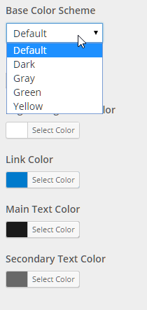
Currently, there are 5 color schemes available in Twenty Sixteen. Only one of theme (the default color scheme) would be considered “high contrast” by WCAG Guidelines for color contrast. The Core Themes response to this issue was:
Not all color schemes have to be accessible, we are doing so for the default and also several others.
And the default color scheme, a pure black and white scheme, naturally is high contrast. But the Grey, Yellow, and (in particular) Green color schemes are decidedly NOT high contrast and really not beneficial for color blind readers.
UPDATE: See Twenty Sixteen’s designer and team leader Takashi Irie’s comment below and link to this commit which makes all the color scheme’s WCAG AA compliant. Whoo hoo!!
This topic was discussed in detail here, but it focused primarily on two things:
- Whether the non-high contrast color schemes should be labelled as “not accessible”. And
- That the Theme Review requirements say that only the default color schemes should be accessible, and that the requirement for other color schemes that are not accessible to be labelled should be removed since it isn’t feasible for the team to review for that.
Curtiss Grymala is a WordPress developer, and is color blind. He raised this issue because he has first-hand experience with unaccessible websites, how to make them accessible, and knows that a WordPress theme can only do so much. But to me, while the two points raise in the ticket above are important, the point Curtiss raised is more important:
If the color schemes that come with the theme aren’t accessible in the first place, it doesn’t matter what content the site owner puts in the site, it will never be accessible.
Basically, the argument that the theme itself cannot make the site accessible isn’t a reason for not giving users the best starting point to have a fully accessible website. When it comes to the Green color scheme, it puts WordPress users on a direct path to inaccessibility. Just because it isn’t the default color scheme doesn’t mean that thousands of WordPress users might just choose that scheme and move on.
Despite all of that, I know from all the other accessibility issues raised and implemented that accessibility is an important issue to the Core Themes team. I do hope however the for Twenty Seventeen we’ll see 100% high-contrast color scheme options. If users want to cripple their accessibility by customizing their color schemes from that point, they can, but why should the theme enable that choice from the beginning?
Plans for Matt2016
So, I’ve started development on my Twenty Sixteen child theme: Matt2016. It will be used on my site around the time WordPress 4.4 rolls out. I’d love your input on what features you’d love to see added to Twenty Sixteen in the comments.
The theme is looking great so far! And YES I love singular.php as well ;)
My all time favorite WP theme was the Twenty 12 because of the clean design and I like seeing that 16 is following that same minimal approach.
Always appreciate your experienced and insightful responses AJ. Thanks for reading!
Hey, Matt!
That’s great. Love the WordPress community, lots of appreciation for all the contributors.
As I mentioned at MWP, I also feel at home with GitHub, contributed twice to TwentySixteen theme. :)
I noticed just the other day you were on the CONTRIBUTORS.md file too! We’re contributor brothers!
Hello, Matt, nice article, I am also in a relationship with singular.php. I’m glad you also highlight the other parts of the Twenty Sixteen, congratulations!
Thanks for reading!
It depends on how you define “high contrast”, but this ins’t entirely true anymore. With this changeset, all bundled colour schemes now have the contrast that WCAG 2.0 level AA requires (4.5:1).
Thanks so much for reading Takashi! It was a serious pleasure to learn from you on this project. That looks like an excellent commit, I’ll pull it down and take a look.
Great post Matt!
I have recently adopted the Twenty Sixteen theme and am loving the experience so far.
Thanks for sharing.
Glad to hear! I’ll be releasing a fork of Twenty Sixteen called “Beyond TwentySixteen”. My site will be run on it and I’m hoping to get it approved on the Theme Directory. Obviously, I’ll blog about that as well, so watch for that. Thanks for reading!
Twenty Sixteen looks nice, except for that hideous black border that makes it suitable only for obituaries. Is there an easy way to get rid of it?
There are color settings. If you set the background color to the same as the page color then it’ll be gone. Or you can change it to any color you like a very non-obituary color like brink pink! Have at it!
Why doesn’t 2016 have logo settings?
I’m very interested in Beyond TwentySixteen. Do you have a link to the fork?
Hi Glen, Glad to hear it! I’m trying to wrap it up soon. I’ll post here and announce via my newsletter when I do.
Thanks!
Fantastic. Is there a way to get updates from this website or thread? I would love to get a message when it is ready or test it anytime. I would love if Twenty sixteen had a one column template option. I can even make it if it hasn’t already been done.
I was using a PC with a small screen before and didn’t see your newsletter sign up link. Can’t wait to try it.
The sign up loading animation has a lot of noise. Would you like me to make a cleaner animation?